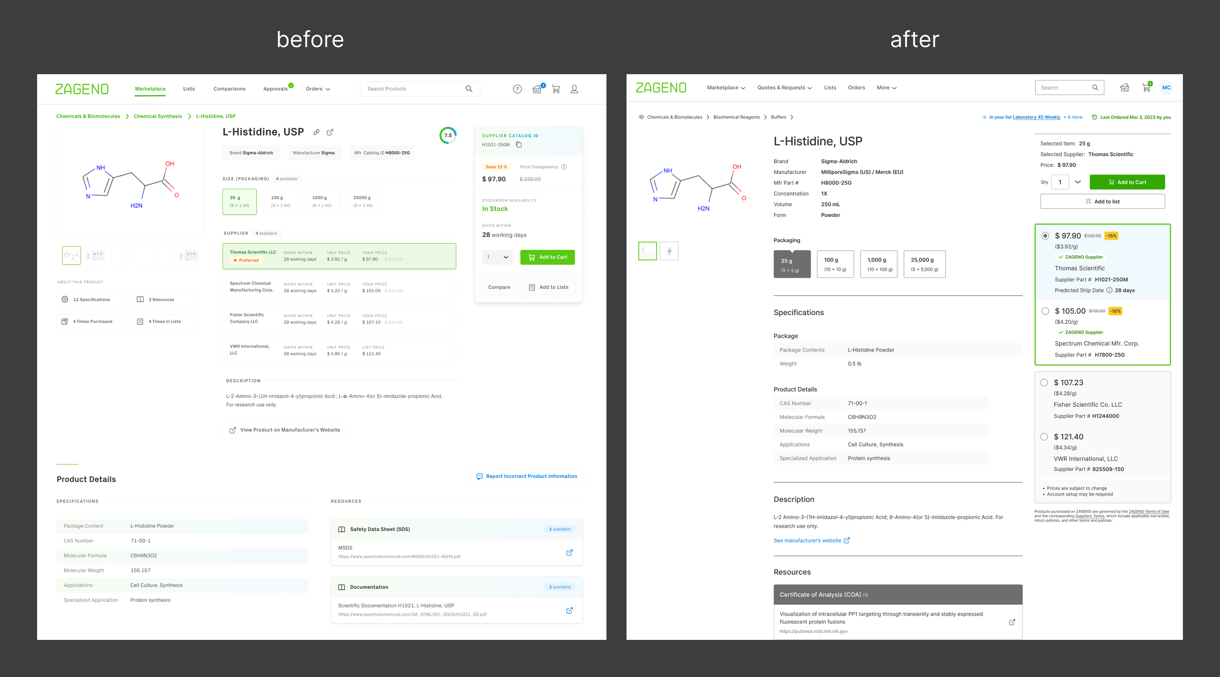
Product Detail Page: Unleashing the Power of the Marketplace
MY ROLE
Lead Designer, working with Head of Product and Engineering Project Lead
Company
ZAGENO, a B2B marketplace of laboratory supplies serving biotech and pharmaceutical companies
The Product Detail Page (PDP) was an important and complex initiative. In the end, my work helped move our metric of conversion upwards by 6% after launch.
ZAGENO is used in science labs and procurement offices to purchase lab supplies
project summary
Business Context
The value proposition of ZAGENO is to make it easier to locate, buy, and account for laboratory supplies.
Business Problems
Low Conversion/Monetization
Customers are not buying enough from those suppliers that would provide the best experience and that would be more lucrative for us
As we started on the project, we realized that strategic business decisions about this hot spot of conversion needed to be clarified so that the design could manifest them.
Customer goals
Find what they’re looking for
Save time & money
Know what’s going on in the buying process
Customer painpoints:
Navigation Complaints
Customers complained that the product detail page was difficult to read and navigate.
Usability Issues
We heard usability complaints from customers, including some serious ones such as ordering the wrong size because it wasn’t clear enough which size was selected.
discovery
Foundational UX research. Comprised of in-depth interviews with users of the marketplace, our Customer Research provided the starting point for our design.
This foundational work helped to strategize and prioritize product initiatives.
Our Buyer’s Journey
Although there were many different kinds of customers making their way through ZAGENO, we chose the a persona with the most agency within the PDP and who might have the most effect on our business.
Persona: Stella, a Principal Scientist at a biotech company
Goal: I want to be able to buy what I need and have it available when my team needs it.
Prioritization
User Scenarios & Use Cases
From the user research we did, we wrote user scenarios that detailed the various journeys our users took to reach their goals on our product. We selected the top user scenarios we wanted to support, and then wrote step-by-step user stories that guided the design to support those flows.
We debated and decided on the prioritization level of many potential user scenarios and use cases, which served to guide the design on what was needed now vs. later.
Design
Heuristic Evaluation
Current problems with the interface
Click data of the current design showed that customers rarely changed the default selected supplier on any given PDP. Qualitative research revealed that some customers didn’t know they could.
We found:
the supplier options lacked interaction affordance, so users didn’t know they could change suppliers
the layout violated some design best practices and design principles of proximity and expected interaction
the color palette as applied did not carry a contrast that was high enough to meet WCAG standards
Design Explorations
There were many, many decisions to make. Here is an example selection:
How many levels of information do we need to account for?
What does the least amount of information for any given product look like? What about the most?
How might we use AI to augment PDPs?
Is there a limit to the number of suppliers we show? How many to show at a time?
What are we naming a “preferred supplier” on the interface?
Do we show placeholder images if there are no images of the product? Can AI help us in this regard?
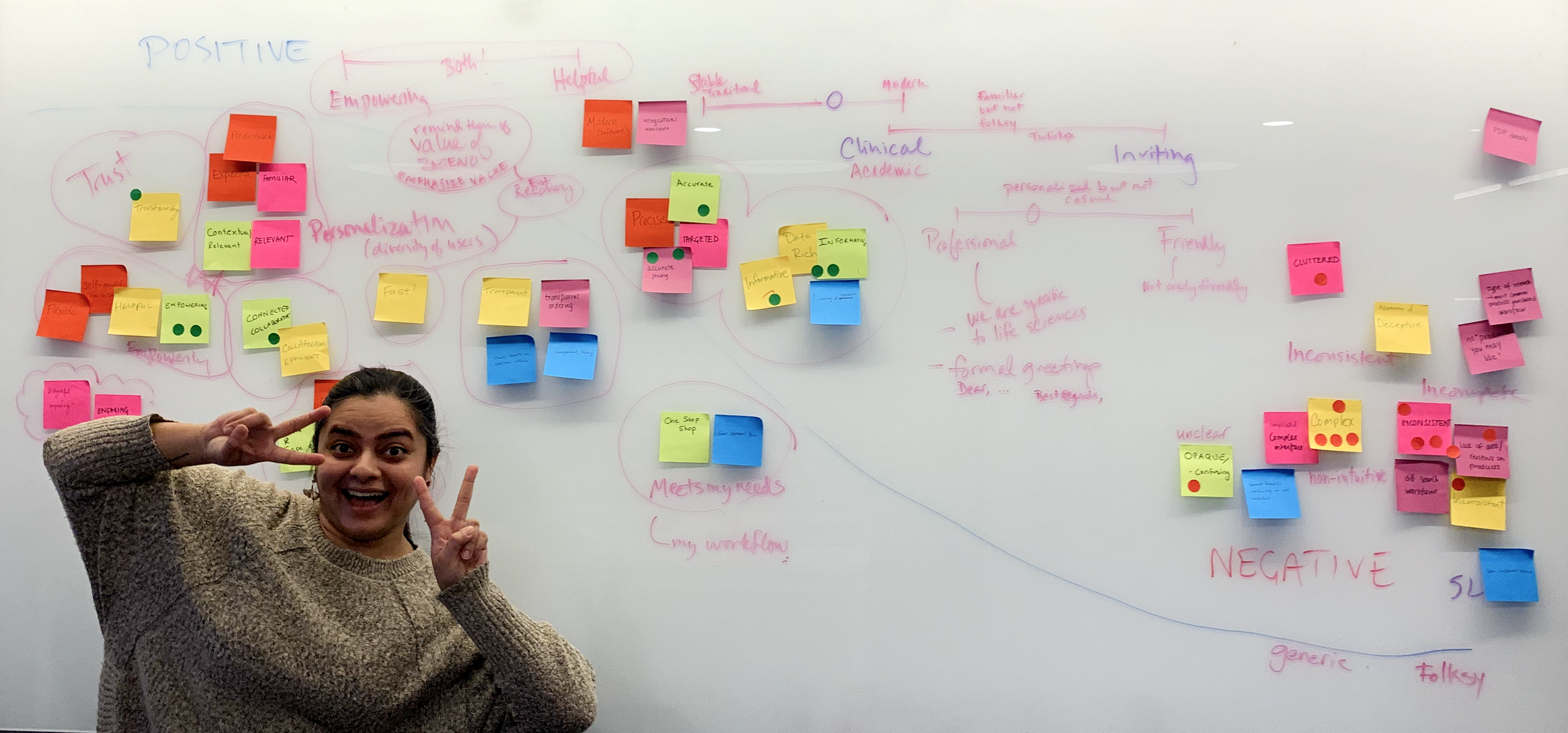
Through whiteboarding sessions and multiple discussions with our stakeholders and SMEs, we made decisions and moved forward with viable, desirable, and feasible solutions.
My Figma file was becoming A Beautiful Mind
Big layout change
Internal and external feedback
We put our top two prototypes in front of our customers and asked questions such as:
What are your first impressions? [brand interpretation]
Does this page give you what you need to proceed? [information hierarchy]
Can you see anything missing? [ideas for future features]
These early feedback sessions gave us confidence we were headed in the right direction. The largest layout change we were proposing—moving the supplier options closer to the Add to Cart CTA—was validated.
Iterations
Decision Time
In the end, our decision about which layout and design to put into production was a collaboration managed by Product and Design (me & Louis) between customer experience goals, business goals, and engineering bandwidth.
Develop
Design specifications: Components, key screens, prototypes
I’ve experimented and collaborated with engineers to refine the process by which we share final designs & specifications. A repeatable, successful framework contains:
High resolution components for visual design
Responsive key screens to show entire high resolution page layouts across devices
Wireframe prototypes for behavior and flow
Design specifications to explain component behavior and any designs that need further clarification
Design-Engineering Close Collaboration
Our engineering manager and I developed a detailed guide that could be used for all ZAGENO’s projects — it covered how designers and engineers work together throughout the Product Lifecycle to manage scope, ensure a smooth hand-off, and ensure that final builds match the designs.
I advocated for thorough design reviews for isolated components in Storybook and for full experiences in staging.
outcome
Increased conversion by 6%
Based on our measurements before the redesign and after, we managed to increase conversion from the PDP from 37% to 43%. (The conversion rate was high to begin with because of the B2B nature of the business).
Next Phases
Next phases will have more chances to move the needle on customer experience and company revenue:
Adding alternative products within the Purchase Panel
Including related products:
Similar products
Bundles
“Other customers also bought”
Recurring orders
Request a product
Customer ratings and reviews


