
A design system for a multi-persona, white-label platform
Role
Design system co-creator
Company
Roostify, a white-label B2B home loan software company

The initial Experience Attribute workshop sparked conversation about the future product’s look and feel.
Experience attribute workshop
To help establish a foundation for the UI look and feel — there was no existing framework and a very basic brand guide — we used a technique we’d employed before: an experience attribute workshop. We threw a variety of photos of people, places, and things on the wall to spark discussion among the stakeholders about what experience they wanted users to have with the interface.
style tiles
The synthesis of these information-gathering sessions informed our first “style tiles”: exemplary fragments of stylistic direction. By checking in with stakeholders and tweaking our direction based on their feedback, the preferred style was applied to archetype screens and iterated.

Style Tiles to show stakeholders how the leading experience attributes might be translated into a visual system
Audit & high-level plan
To design any system, one has to have a good idea of the content of that system, as well as the people using it. The product and subject matter in this world was unusually complicated. The data involved in getting a home loan is voluminous, and we had multiple personas to address: the borrower(s), lender team, and real estate team, all within a white-label, adaptable system that would adapt to our direct customers, the lending companies themselves.
When a project is too big to tackle all at once, it has to be broken down into smaller, digestible pieces, then planned in phases. We decided to focus our first phase on one user role – our primary persona, the borrower – whose artifacts formed the basis of the design system. We could then add other interface components when resources freed up. This approach would give us more time to fully understand our secondary personas’ goals, mental models, and workflows.

Original legacy design
execution
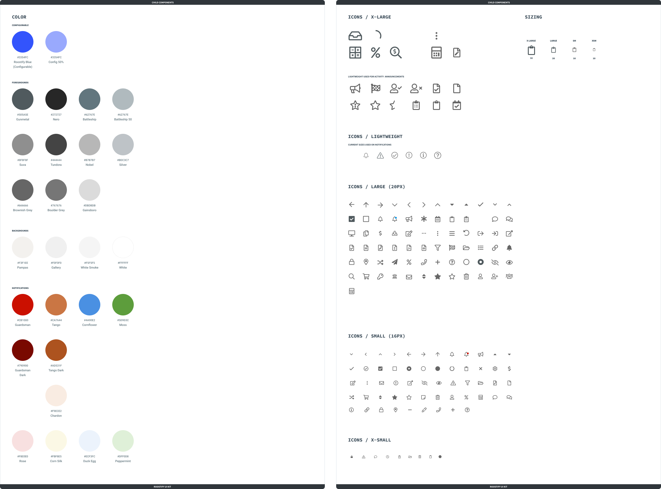
This was a project that depended on close collaboration within the design team to tackle the enormous workload smoothly and efficiently. We used the Atomic Design framework to organize our design system from the foundational atomic elements, through molecules, organisms, and finally, page templates. We designed components to be used across our responsive design system. We rearranged the layout and responsive grid.

Communication with internal and external stakeholders
We gave updates to the wider company on a regular basis, and met regularly with the development team. We solicited feedback from various stakeholders within the company, especially SMEs and the leadership team. Customers were kept informed of changes coming by following a go-to-market plan.
design tool change
As forewarned by the wider design community, it proved difficult to keep the design system up to date with our current process and tools. We decided to invest the time and effort to move to a more robust and responsive application, Figma. This proved to be a great catalyst for our process, allowing us to explore, share, and iterate ideas in a much quicker cadence.

Examples of internal guides we created for Figma.

We brought the design system a long way:

…and planned a future which consolidated all a borrower’s and lender’s needs into one platform:

